Most Popular Photoshop Tutorials - 2008
posted under
Tutorials
by Pshop tuts

Adobe Photoshop is the tool of choice for most web designers. From creating a website template to objects and components such as content boxes and buttons, Photoshop doesn’t fail to deliver.
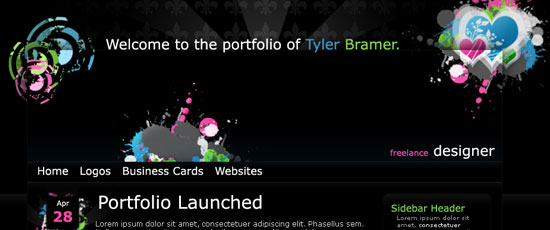
In this collection, you’ll find Photoshop tutorials geared towards web designers. You’ll find a variety of tutorials that include creating full web page templates, navigation menus, headers, and content boxes.


Start by creating a new document to make your button in, otherwise open up a website design you’ve been working on. I created a small document sized 400 x 110, just to make my button(s) in.
Now you need to make the shape of your button, you can do this by either using the Rounded Rectangle Tool (which is the most common) or you could use the channels to create a nice, uniform rounded box. It’ll be best if you just use the Rounded Rectangle Tool though.

For the settings, use a radius of about 10-15px, you can see the other settings I’ve used below:
![]()
Now, draw out your button onto the canvas in whatever color you want. (it doesn’t matter what color you use)

Right-click your button layer in your layer’s palette then go into the Blending Options, click and apply the following settings:
Inner shadowYou can use whatever colors you want in the above layer styles, but your button should now look something like this anyway:

Now it’s time to add a nice, glossy shine to the button. Start by making a selection around your button (Select > Load Selection) then contract your selection by about 5 pixels (Select > Modify > Contract) now you should be left with a selection like this:

Create a new layer then drag a white to transparent gradient from the top of the selection to the bottom, as shown in the below image:

Now you need to make a curvy path using the Pen Tool, turn your path into a selection then delete the bottom half of the gradient, something like this:

I also used a large, soft brush to erase away the bottom edges, this gives it a very nice, smooth feel.
Now it’s time to add your text to the button! Start by getting out the Horizontal Type Tool (T) then write out your text.

The font I’ve used above is called Myriad Pro, for the top line of text I used: Black Italic, 24 pt, Sharp, #fff.
For the bottom line of text I used: Semibold Italic, 12 pt, Sharp, #fff. I finished off by adding this Drop shadow to the text layer.

Lastly, for a nice touch, I added in a reflection to the button and a faded cog in the bottom left corner. Add the shadow/reflection by duplicating your main button later, moving it below your button layer then erase all but the top.

And that’s pretty much it. I also created a red version of the button though.


Photos are often much more interesting when they are displayed like a Polaroid photo. Learn how you can turn your normal photo into something livelier, by adding a realistic Polaroid effect to it.
Color Overlay
Color: White [#ffffff]
Let’s determine how big our image will be within a Polaroid.


The photo looks a bit stiff to me at this stage. Lets tweak it so it looks that it looks more blending into the Polaroid.
Inner Shadow
- Opacity: 40%
- Distance: 0px
- Choke: 0%
- Size: 46px


The photo is almost done, add some writings. Fonts close to handwriting will be nice. Here’s my final output.